James Branch Cabell : An Illustrated Bibliography
BEYOND LIFE: Dizain des Demiurges
James Hall Code |
Description |
BL-A1 |
|
BL-A1a |
|
BL-A2 |
|
BL-A3 (K) |
|
BL-A4 (K) |
|
BL-A5 (K) |
|
BL-A6 (K) |
|
BL-B1/*B8 (ML) |
|
BL-C1 (E) |
|
BL-C1a (E) |
|
BL-D1 (S) |
|
BL-E1 |
|
*BL-Ger-1 |
The Italian Chocolate Binding:
 Probably no other issue in the Cabell canon has been so regularly mis-identified by collectors and non-specialist dealers as the "Italian chocolate" binding of Beyond Life. Just about every Cabell collector and scholar has seen copies of this title claimed by hopeful sellers to be in the "rare Italian chocolate binding," but when actually examined are found to be in the normal binding after all. In my own collection, I have six copies of the first printing of Beyond Life, all in the regular brown binding. Two of these have dealer's notations in pencil on the FFEP, claiming that they are "Italian chocolate." They aren't, worse luck.
A large part of the problem is that the "normal" binding is a much darker brown than that of any other Cabell title issued by McBride, and, for that matter, actually does resemble the rich brown color of a good quality bar of dark chocolate. It's easy to see how someone not a Cabell specialist could be misled. Recently, Bill Lloyd and I were given the unusual opportunity to examine an Italian chocolate copy of Beyond Life of unquestionable provenance - James Branch Cabell's personal copy, which is part of his own library, preserved in the James Branch Cabell Library at Virginia Commonwealth University.
All of Cabell's previous bibliographers were consistent in their descriptions of this binding: Merle Johnson (1921) called it so dark as to be almost black; both Guy Holt (1925) and I.R. Brussel (1932) stated that it was very dark cloth ... which approaches black; Frances Brewer (1957) described it as very dark brown, almost black; and James Hall (1972) echoed the previous observations with very dark brown, almost black ... probably more accurately called sepia.
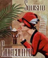
Binding colors are notoriously subject to change over time, of course, and no one alive today can say for certain just what this binding looked like when it was issued a century ago. Additionally, in over thirty years of collecting and studying Cabell's works, this is the only copy I've seen in this binding, so my pool of examples could not be any narrower. At the same time, though, I could not avoid being impressed by the appropriateness of the term "Italian chocolate." It does indeed resemble the dark, greyish brown color of, not a chocolate candy, but a fresh cup of cioccolata calda.
Clicking on the picture of the exquisite signorina above left will bring you not, alas, to a seat across the table from her, but to a comparison of the Italian chocolate (at left) and normal bindings.
- John Thorne, 2017