The Silver Stallion: Cabellian Arts
Map of Poictesme
Frank Cheyne Papé
Hall Code |
Description |
G2 |
|
*G2a |
|
*G2b (?) |
Papé's Map of Poictesme
 In his bibliography, Hall describes the Papé Map of Poictesme very briefly: This is the map originally used as end-papers for the first large paper edition of THE SILVER STALLION; a few copies were issued in broadside form. This is a scarce item.
In Kalki No. 34 (1988), Nelson Bond substantially expands this short description in an article titled Papé's Map of Poictesme. Bond notes two different printings - one with a single line of text, and one with four lines. He was unable to assign precedence between them, and The Silver Stallion cannot add anything to that question. For indexing purposes, though,we have assigned Hall Code G2 to the single line version, and *G2a to the four line printing. This should be not taken to indicate which of the two is the earlier printing.
In this article, Bond makes three statements that, in the light of present knowledge, need further review and discussion. The present writer (Thorne) acquired a copy of the *G2a version of this map from Mr. Bond shortly before the Kalki article appeared. At that time, he told me that it was in fact the actual copy of the 4-line version that he discusses in his article.
In the Kalki article, Bond states that information had "trickled" to him that the map measured 23 x 19-inches. He further states that both of his copies measure 20 x 16. Although it seems an odd lapse, we have to conclude that Bond was somewhat obtuse in making this statement. While he was certainly correct in that the map image itself , excluding borders and text, measures, in both cases, 20 x 16, it is equally correct that, again in both cases, the overall broadside measures 23 x 19-inches.
Bond also states that the map was originally described to him as a "folded broadside". One of the reasons Bond gives for dismissing the "folded broadside" description is that both of his copies are, he states, printed on heavy buff card stock, and could not be folded without ruining them. When I received my copy of *G2a from him, it was framed, although very poorly. I immediately had it reframed, and in fact I had never seen it out of a frame until recently, twenty-five plus years later, when I had it scanned for The Silver Stallion. This copy is not in fact printed on card stock at all, but on a thin but very high quality art paper. I cannot explain the discrepancy, other than to speculate that perhaps Bond never actually removed the *G2a copy from its frame, but made the assumption that it was on heavy stock based in its resemblance to his G2 copy. I am certain that he acquired it already framed, since he made a point of mentioning the poor quality of the frame in our discussions.
The scanned copy of G2 shown here is taken from an original in the Burton Emmett Collection at the Ackland Art Museum, University of North Carolina at Chapel Hill, and is reproduced with permission. This example is, in fact, printed on a much heavier stock than that used for *G2a. Another copy of the map has recently come to light, and interestingly enough, this copy can be very accurately described as a "folded broadside". We have included it here, although we are far from certain that this is not an owner's modification of what was originally a copy of G2. We have given it code *G2b (?), the question mark indicating our uncertainty about its validity. One thing is certain, though, our *G2b (?) copy is, like G2, printed on a heavy stock that could not have been folded without damage. However, a more sophisticated and stylish technique was used to produce it. It was sectioned into eight panels, mounted on a linen backing, folded, and bound in blue buckram as a thin medium octavo [23.8 cm. (9 ⅜-inches) x 15.2 cm. (6 inches)].
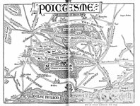
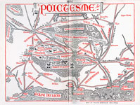 The third point Bond raises involves spelling errors. In addition to the stand-alone issues, this map was used as endpapers for The Silver Stallion, on both the first printing, large paper issue (SS-A1a, 1926, far left) and the Papé illustrated editions [American - SS-D1 (P); and English - SS-E1 (P), both 1928, near left]. Based on a letter from Cabell to Ben Abramson, he quite correctly mentions three spelling errors on the broadside: "Bassardra" should be "Bassarde", "Aradel" should be "Aradol", and "St. Aumes" should be "St. Aunes". He then states, though, that these had been corrected on the version used as endpapers. This turns out to be not quite correct. In the article, he says "[u]nlike the end-paper map for THE SILVER STALLION, which is printed in red and black, this map is elaborately decorated in shades of red, gold, green, blue, violet, and black. Moreover, it represents an earlier form of the map than that in the book..." In fact, only the 1928 illustrated editions have the map printed in red and black, and have had the place names corrected. The 1926 endpaper map is in black and white only, and still contains the erroneous spellings. The obvious conclusion is that the corrections were made after the 1926 publications, but before 1928.
Although we have raised a few concerns with the details of the article, we still feel that Bond's article, with our commentary, is the best discussion we've seen on this map. The entire article is available on The Silver Stallion as a PDF file. Click on the image at the beginning of this article to access it. You'll need to use your browser's "BACK" button to return here afterwards.